
Mike Paints Tyranids: Stat Check Community Spotlight
Mike is one of the community members here at the Stat Check Discord, His Tyranids are a wonder to behold, and with that we’ve asked him to put together some notes on how it all comes together. The following is taken directly from Mike with no content editing. Thank you to Mike for providing the photos and text of the following article.
Mike Paints Tyranids - by Mike

Hello,
My name is Mike and I love to paint. While I’ve only achieved mid table terror status at events, I have won multiple best painted awards. I won’t claim to have what it takes to win a golden demon, but I do understand what it takes to paint an army that’s striking on the table and done in a way that’s sustainable to prevent burn out.
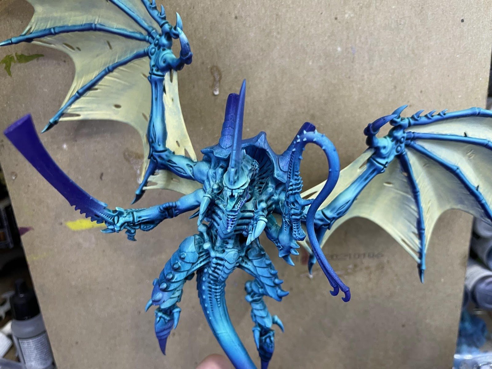
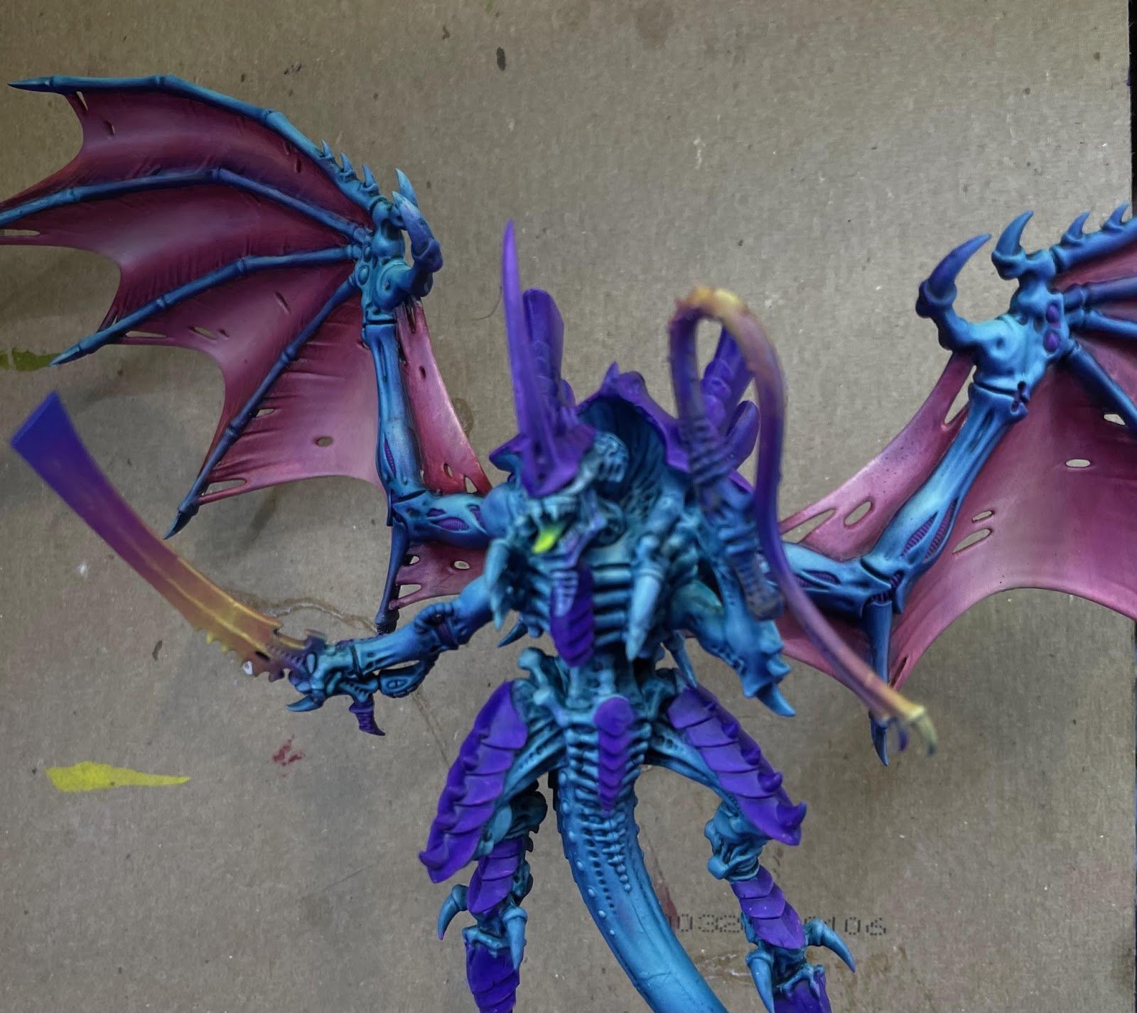
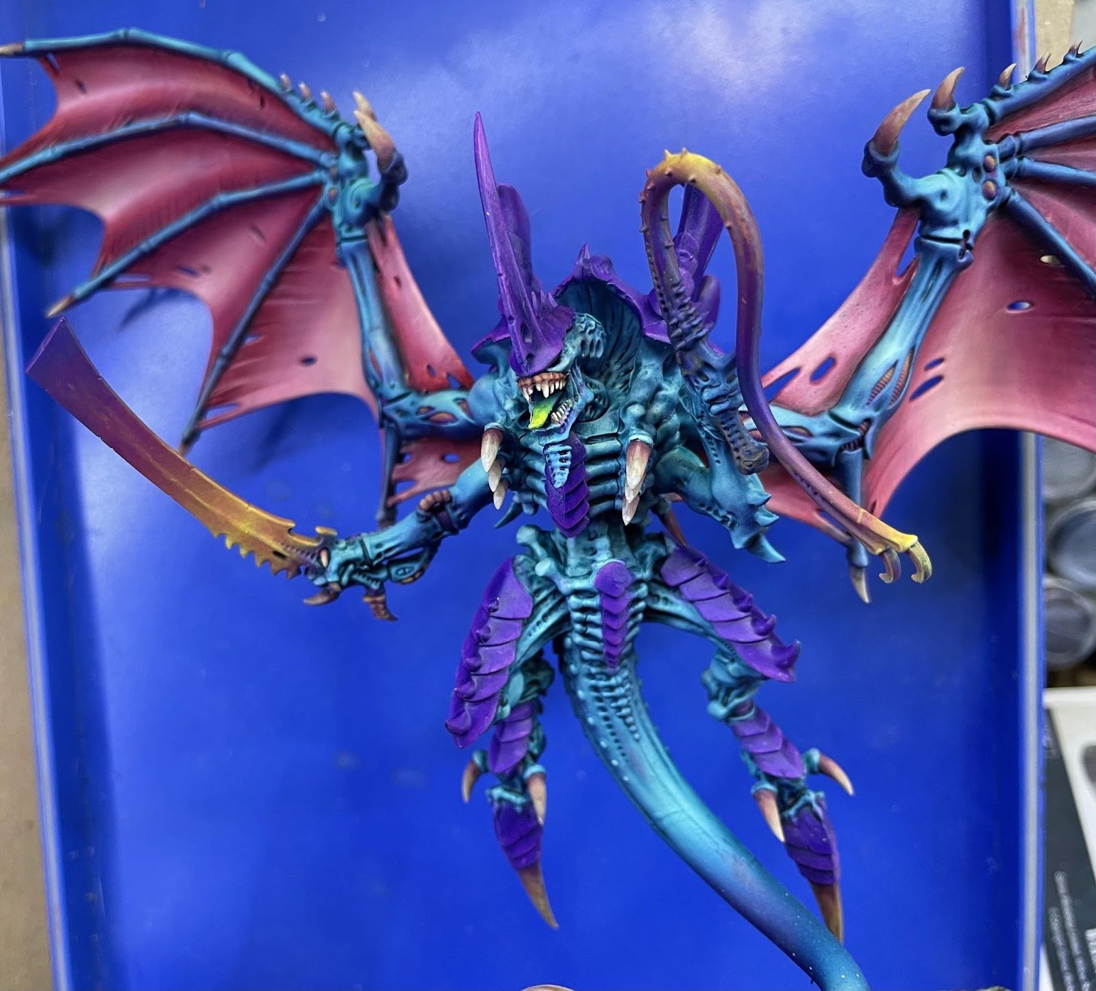
I’m going to walk you through how to paint a big centerpiece model (winged hive tyrant) and hopefully inspire you to bring some of the techniques I use to your own army. At the end of all this, the tyrant is going to look like this:
Hive Tyrant
Photo Credit: Mike
Supplies Required:
If you want to follow along step by step, this is a list of every paint I use. I use an airbrush heavily and I also use oil paints. I will be explaining how I use both tools as part of the process.
Makeup sponges cut up into little strips
Liquitex Dioxazine Purple Ink
VJMC Violet
VJGC Turquoise
VJMC Blue-Green
VJMC Ice Yellow
AK Gen3 Laser Magenta
AK Gen3 Oceanic Blue
ScaleColor Deep Red
ScaleColor Iroko
ScaleColor Birch
ScaleColor Sol Yellow
Winsor & Newton Artist Oil Dioxazine Purple
Winsor & Newton Artist Oil Quinacridone Magenta
Winsor & Newton Artist Oil Quinacridone Red
Winsor & Newton Artist Oil Titanium White
Winsor & Newton Artist Oil Naples Yellow Light
Winsor & Newton Artist Oil Alizarin Crimson
Gamblin Artist Oil Phthalo Turquoise
Palette paper (parchment paper taped to cardboard works too)
A Few Words on Oil Paints
I use oils a lot in painting this model. The benefits of oils are that they take a long time to dry, meaning more time to work, and with oils you can get some really high quality pigments that make certain kinds of colors very easy to paint. The downside of oils is that they take a long time to dry, so they aren’t conducive to getting minis on the table fast, and those high quality pigments can be expensive. With oils you also have to deal with a bunch of classical art concepts that hobby paint lines hide from you. If you’re passionate about painting and interested in playing around with oils they’re a lot of fun.
Deciding on a Color Scheme
Color Theory

Before I can talk about picking colors I need to talk about color theory. Color theory is a deep topic, I’m just going to give it a superficial explanation. If you’re not familiar with a color wheel: colors opposite on the wheel are complimentary, and tend to balance one another out in a color scheme. However when you directly mix complementary colors it pulls the result towards the middle of the wheel, which ends up looking like mud.
There are many different methods picking complimentary colors, you can read more about them here:
Photo Credit: Oberlo
https://www.oberlo.com/blog/color-combinations-cheat-sheet
When you blend multiple colors together you will have the easiest time blending with colors adjacent on the color wheel. When you blend two colors, imagine you’re pulling two points on the color wheel towards one another. How far each point goes depends on the relative strength of the pigments, but that’s a discussion for a different article.
The color wheel is divided into warm and cool colors. The warm colors are red-violet (10 o’clock) through yellow green (4 o’clock). The others are the cool colors. When you are painting you are going to want a balance of warm and cool. It’s also important to keep in mind that the eye is naturally drawn to warm colors, so you can use that to create points of interest on the model.
When you pick a color scheme you need to decide the colors for your lights, and your shadows. The most straightforward schemes have warm light and cool shadows, as that mimics what we are used to seeing in the real world. However if you want to paint a night scene or something surreal looking you can go with cool light and warm shadows. If you want to watch a somebody put on a clinic on using warm shadows, watch Angel Giraldez talk about painting purple https://www.youtube.com/watch?v=eIy7ITwZVkA.
Another important consideration for choosing a color scheme is to try and use the fewest number of colors possible. The more you base your scheme on a handful of paints, and then mix the shadows and highlights from those base paints, the more unified the scheme will appear. This is something that is hard to qualify, but you know it when you see it. Conversely, if you use a large range of random colors from the color wheel it will seem off, maybe noisy. This is why artists of all disciplines work with color palettes. Deciding your colors up front can be intimidating, but it gets easier with practice.
Picking The Colors

For the tyrant I want my main color to be turquoise. Why turquoise? I find it to be a very versatile color and suitably alien looking for Tyranid skin. You can blend with it blue, green, and violet pretty easily to create some very interesting transitions, and opposite on the wheel is orange, one of my favorite warm colors to work with. Turquoise also mixes easily with yellow for creating highlights. The chitin will be purple for a couple of reasons. The most important of which purple just looks really good with turquoise, and is an analogous color to turquoise. I’m also using purple as the shadows on the skin, using the same color on the chin will bring harmony to the model.
Photo Credit: Oberlo
https://www.oberlo.com/blog/color-combinations-cheat-sheet
Regardless of what colors you decide to paint your models, it’s important to think about how you are going to create visual interest. There’s two ways you can do that: going around the circumference of the color wheel (changing hue) or by changing the value (lightness vs darkness) of the color. Generally you want to be doing both at the same time, otherwise it looks fake or flat.
Since I talked about value, here’s a quick side tangent about white + black. You almost never want to be lightening your paints with white and you similarly almost never want to be darkening your colors with black. Both white and black desaturate the color. When we’re looking at shadows it’s very rare that the shadowed area is just a desaturated version of the main color. There is light reflecting off the world to the shadowed area which changes the perceived color just a bit.
For darkening it’s usually more interesting to go adjacent on the color wheel, pick a darker color, and blend towards that. To lighten you almost always want to mix a tiny bit of yellow in, this is because objects in daylight have yellow put into them by virtue of the sun’s light being warm. VJMC Ice Yellow is pretty much the perfect color for this.
Painting a Hive Tyrant
Ok, enough preamble. Lets paint the model.
Skin
For those that are familiar with slap chop, painting the skin is going to be like doing a fancy version of that. For those who aren't familiar, slap chop is the idea that you place the value down first (brightness) and then apply the color over top. This creates natural shading that’s pretty quick to do and gives good results. For the tyrant I’m going to sketch not only the values, but incorporate shifts in color too, with the hope of creating more interesting shadows and more vibrant highlights. I’m going to go pretty extreme with the base layers, but then apply an oil wash at the end that is going to average everything out and make it look really nice.
Base Coat
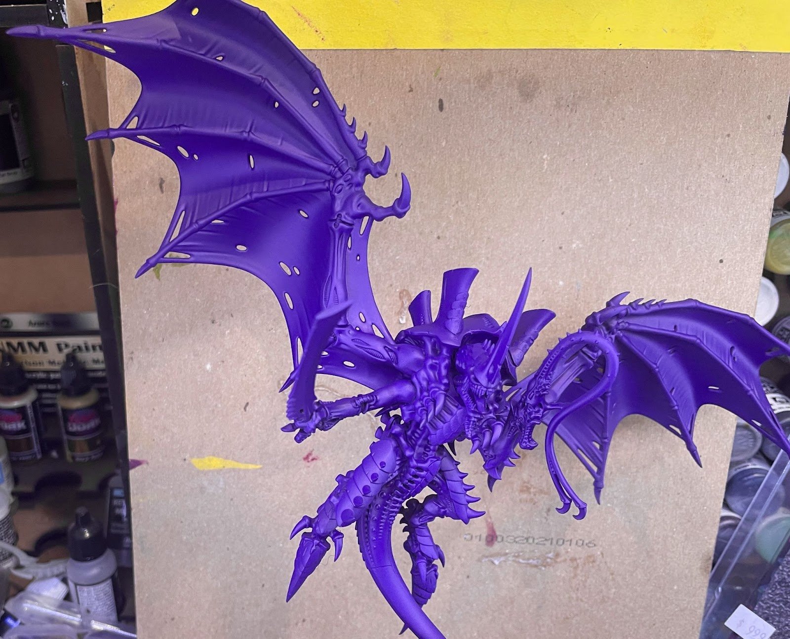
VJMC Violet + Dioxazine Ink through the airbrush. Airbrushing has a tendency to desaturate colors a little bit, adding the ink brings the vibrancy back. This is going to form the shadows of the skin.
Base Coat
Photo Credit: Mike
1st Highlight
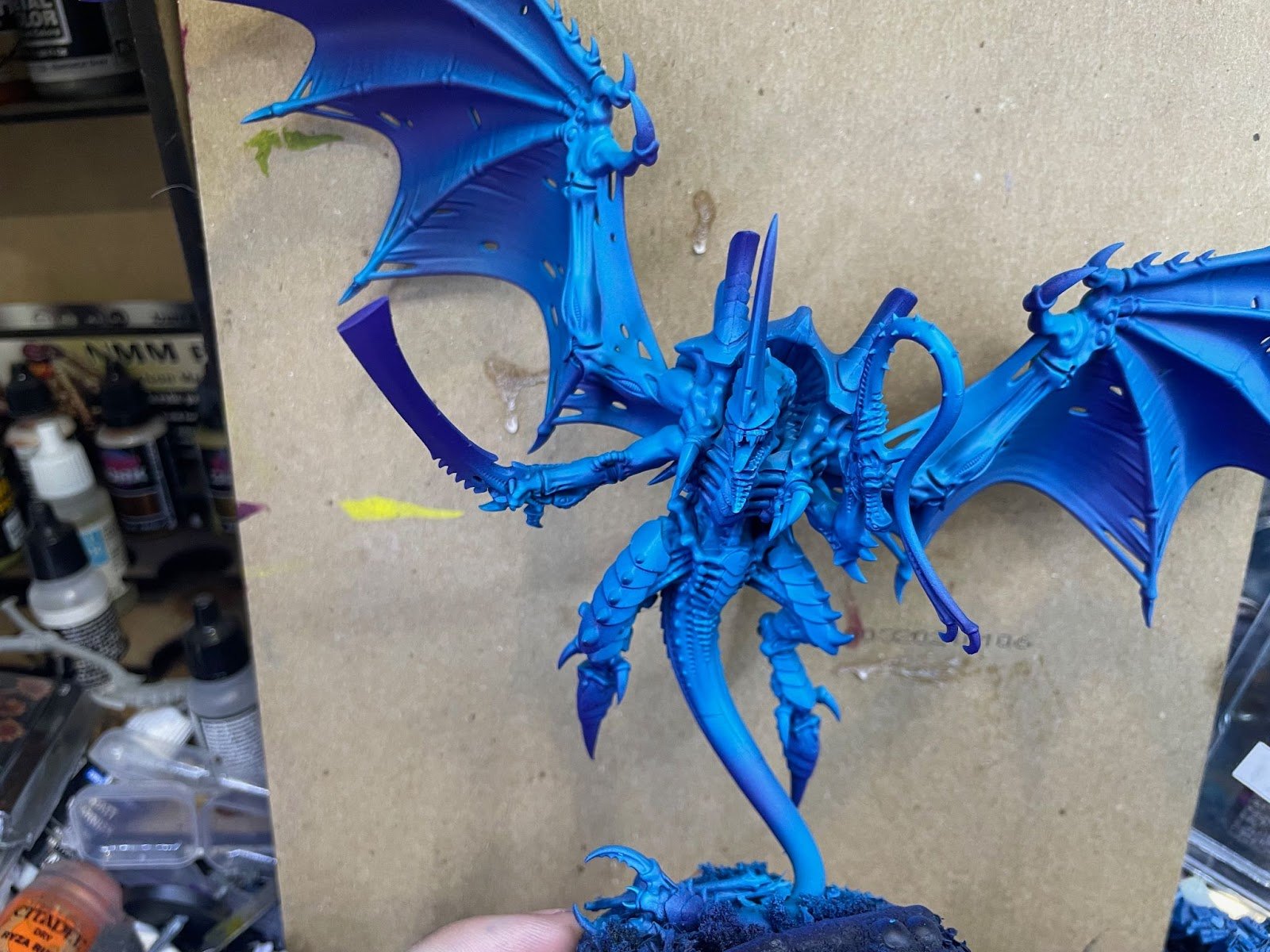
VJGC Turquoise through the airbrush. Here I’m doing a zenithal with the turquoise leaving some shadow obviously visible. In big flat areas like the tail I’m trying to create visual interest by introducing artificial areas of light and dark.
1st Highlight
Photo Credit: Mike
2nd Highlight

The same idea as the previous highlight, but using VJMC blue-green and covering a slightly smaller area. Don’t worry about overspray.
2nd Highlight
Photo Credit: Mike
3rd Highlight
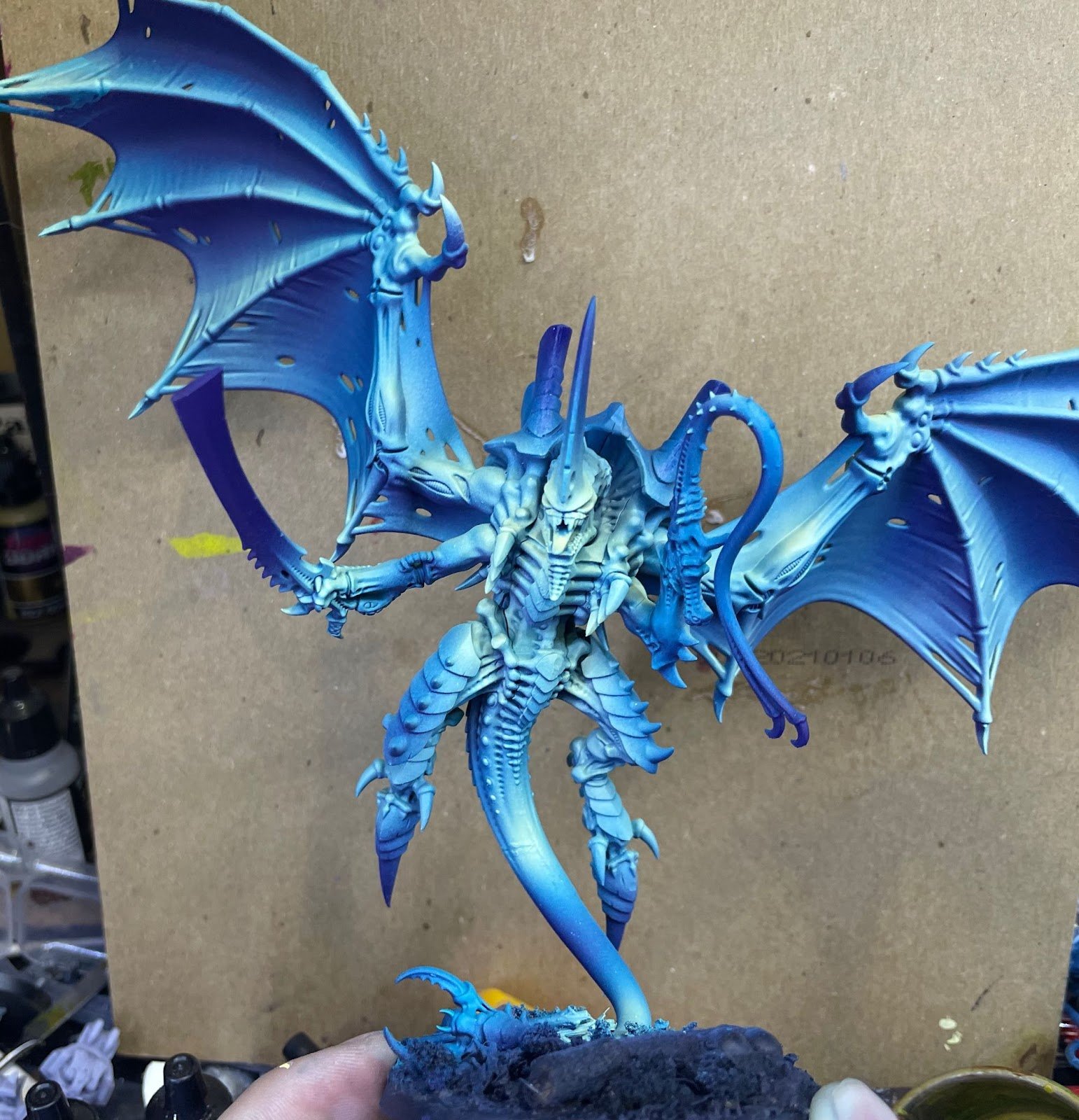
Here I’m using VJMC ice yellow, and deciding where my points of interest are going to be.
I picked his face, “hands”, biceps, and spots on the tail. At this point my tyrant looks like a clown, but that will get fixed in the next step.
3rd Highlight
Photo Credit: Mike
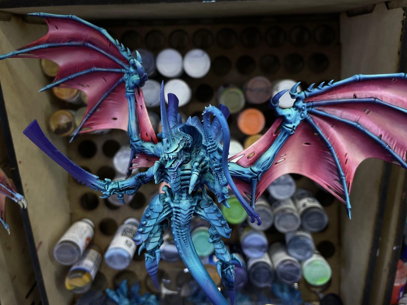
Oil Wash
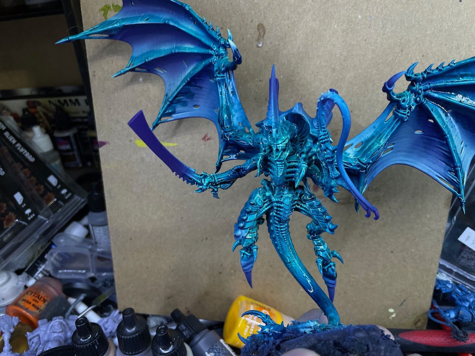
Now I apply an oil wash made of mixing Gamblin Pthalo turquoise with thinner. There’s no perfect ratio here. Basically the thicker the wash the more it will stain the underlying paint.
The thickness I use is roughly that of milk. If the wash just instantly goes into all the crevices it’s too thin and it’s better to err on the side of too thick to get the desired effect.
Oil Wash
Photo Credit: Mike

I let it dry for about half an hour, then wipe off all the oil paints with cut up makeup sponges. If you are doing this process you will want to wear gloves for this as it's fairly messy.
You want to pull the sponge down towards the shadows, leaving the illuminated parts of the model the brightest.
This is what it looks like after wiping off the wash, I love the color at this stage. I wait for the wash to fully dry before moving on, 24 hours should be enough.
Oil Wash 2
Photo Credit: Mike
Wings
For the wings I use a very similar process to the skin, except I go harder into actual painting than just using an oil wash. The first step is to prepare the area of the skin. I’m going to be building a dark to light fade, so I want the base of the wing skin to be light and I’ll use oil paints to darken it.
I use an off white acrylic paint as a base coat, the specific color doesn’t really matter. GW wraithbone or VJMC light sand work fine. I apply a few thin coats with a brush until there’s good coverage, it doesn’t need to be perfect.
Wings
Photo Credit: Mike

Next I take Permanent alizarin crimson and apply it all over the wings. I let it dry for about 30 minutes and then wipe it off with a makeup sponge.
I spend more time removing paint from the bright parts of the wings and basically ignore the deepest shadows. If you are trying to do something similar and you’re less comfortable with oils I think it’s completely fine to leave it at this stage, it still looks pretty good.
Wings 2
Photo Credit: Mike
Adding Definition to the Wings
To really take the gradient to the next level I’m going to mix in some more oil paints to really make the wings stand out. As I work through the steps below I’m not especially concerned with how smooth the transitions are, it’s a sketch that we’re going to fix at the end using the full power of oil paints.
The paint I apply are as follows:
Quinacridone red + naples yellow light, cover most of the wing area leaving dark shadows as alizarin crimson.
Add more naples yellow light, cover less area making a highlight for the wing.
Mix Ultramarine + Quinacridone red to make a purple and put it in the recesses of the wing creating a deep shadow. The reason I chose ultramarine is that it is a red-biased blue, meaning it will mix happily with quinacridone red, a blue-biased red.
Finally, I put a little bit of pure Naples yellow light in the highest areas.
Adding Definition to the Wings
Photo Credit: Mike
Now comes the fun part, blending. I take a brush with soft bristles and is relatively big, like size 4+. I hold it very lightly, and kind of stipple it into the oil paint. This has the effect of mixing the paint on the surface and blends the two colors together. As this happens the brush will accumulate some paint, so I make sure to wipe it off on a paper tower occasionally. I go through all the color boundaries and smooth them all out.
This is an iterative process and requires going back and adding paint to the surface of the wing to get the effect that I want. Because oil paints stay dry for hours, sometimes days, you don’t have to get it right the first time. I try to keep mixes on the palette so I can add it to the appropriate part of the wing as needed.
Adding Definition to the Wings 2
Photo Credit: Mike
Carapace
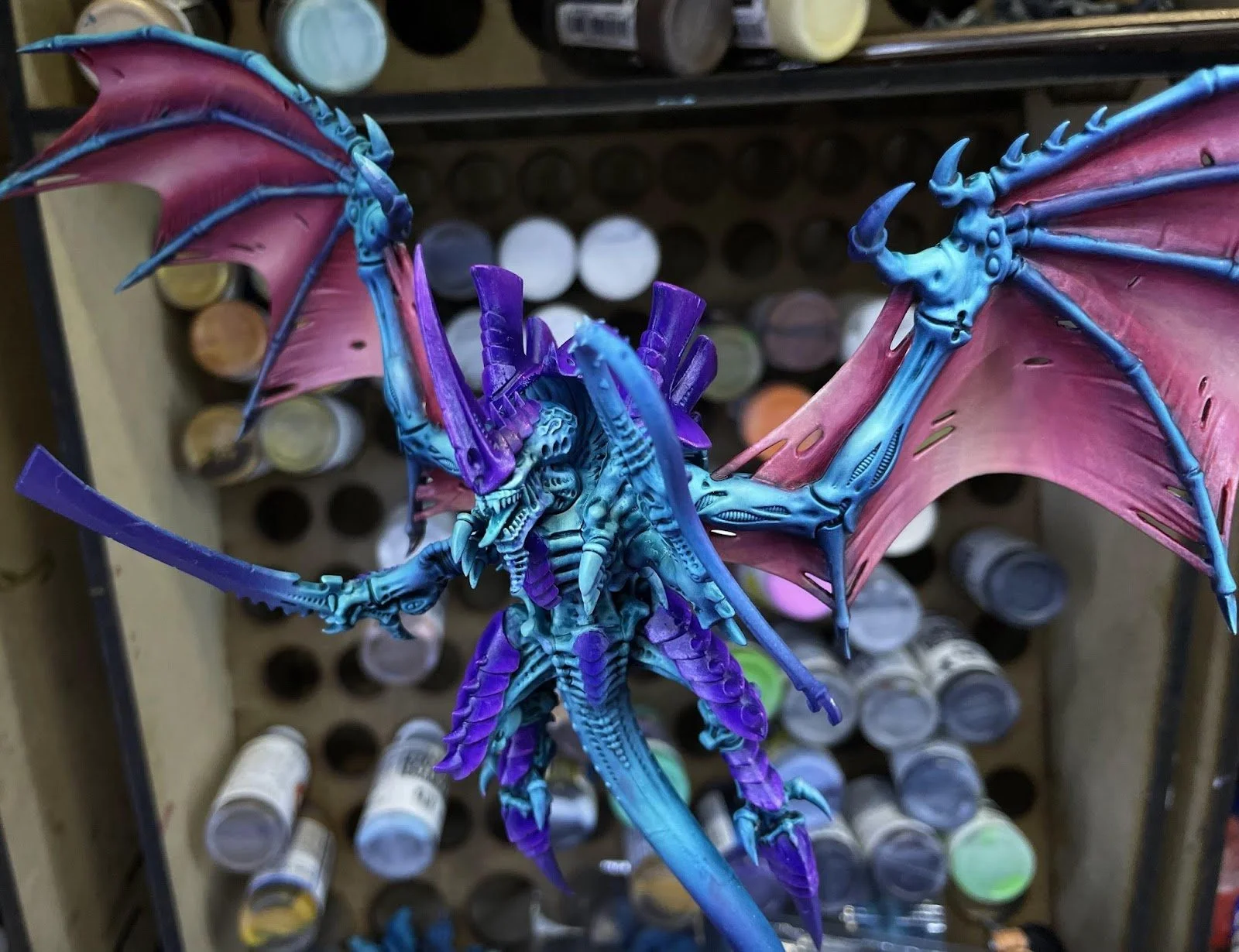
I want the carapace to match the shadows of the skin, so I use a paint with the same pigment as the ink that was used in the airbrushing stage. Just because I like the color, I mix Dioxazine Purple with some Quinacrindone Magenta and a small amount of titanium white to give it some opacity (otherwise both those paints are very transparent).
This stage is basic oil painting. I take a decent sized brush (2+) with stiff bristles and put some paint on the brush. I remove most of it on a piece of palette paper, I know I have the right amount of paint when I can hear the bristles scraping against the paper. Applying the paint to the carapace is like dry brushing, but it gets way better coverage. I keep going until all the chitin is covered in the purple mixture.
Carapce
Photo Credit: Mike
The first highlight is a mixture of quinacridone magenta and white. The highlight stage is probably the part I find the most difficult. If you add too much white the highlight looks wrong, if you add too little there’s no contrast between the highlight and the chitin. Because of the magic of oils, I don’t stress about it too much because I have time to get it right and in the worst case scenario I can wipe the paint off and start over. I “drybrush” the paint up from the edges of the plates so that the brush catches on the edge and creates a natural scratchy texture. I repeat for all the plates until I’m happy with the effect. I work the color pretty deep into the chitin, covering about 40% of the plates.
The last highlight is a mixture of quinacridone red and titanium white, to create a pink color. I apply it in the same way but this time covering a much smaller area. The pink created by the mixture will quickly overpower the purple carapace, so use it sparingly.
Sword + Whip
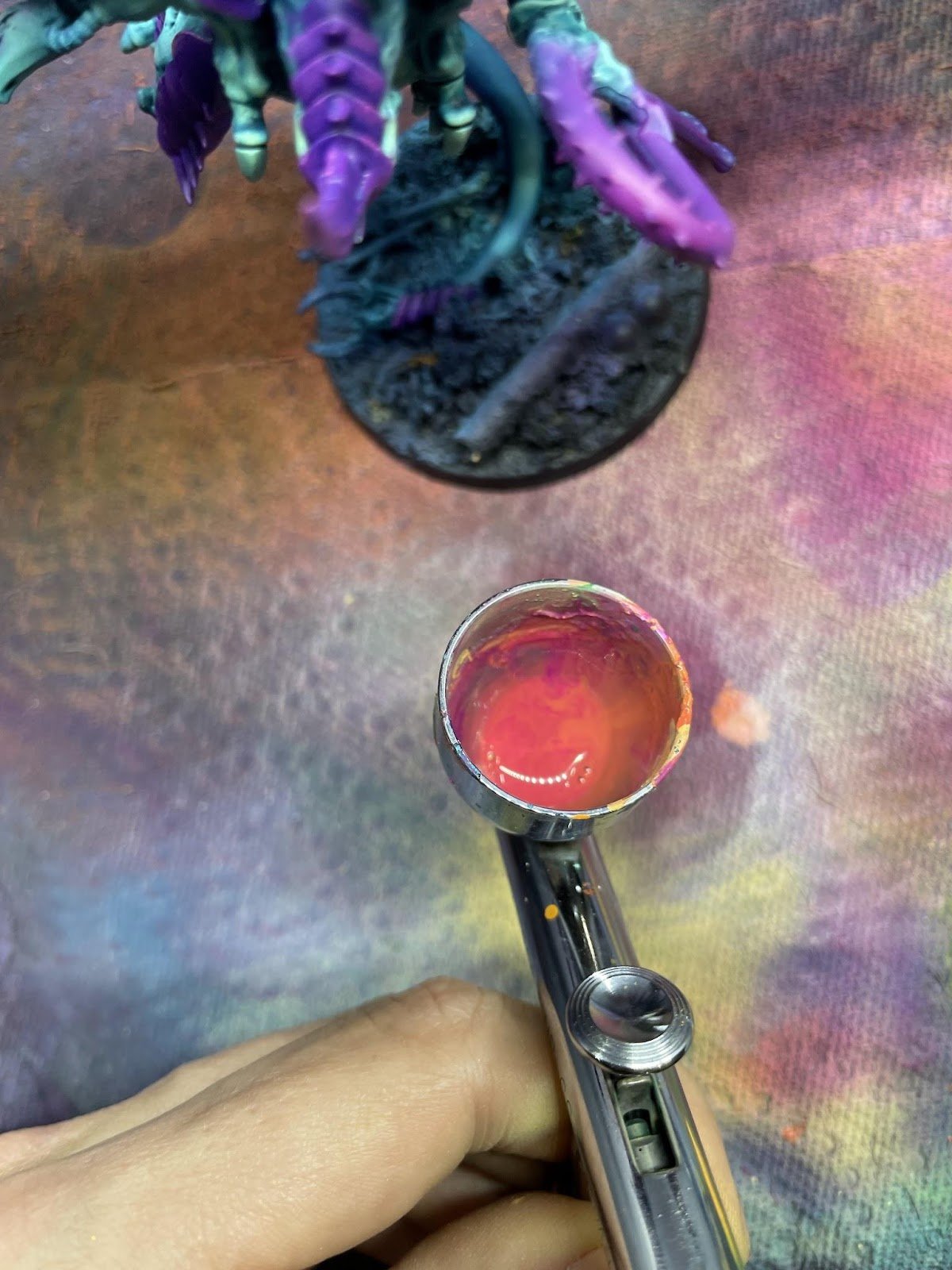
I want the sword and the whip to be points of interest, and the eye is naturally drawn to warm colors. So here I want to make both have points of orange. I sketch the colors on both first with an airbrush and then go with a brush after to add emphasis. You can get amazing orange colors by mixing magenta and yellow. I start with AK Laser Magenta as a base.
I progressively add more ScaleColor Golden Yellow to the cup in the airbrush and work towards the bright points. It’s worth mentioning that I had to have a very light touch when doing the whip so that I didn’t get overspray on the rest of the model. If you are a more careful person than I am, you could wrap the rest of the model in saran wrap to protect it while you do this.
Sword and Whip
Photo Credit: Mike
When doing gradients with a brush, I like to mix the complete gradient on my wet palette and work from that. That way I can work on any part of the transition without having to mix paint again. I added definition to the sword and whip along the gradient using paint from my palette.
When you’re painting over airbrush work it’s very important to thin your paints, and make sure that you haven’t overloaded your brush. Wipe off excess on a paper towel. This stage is a matter of taking the mix from my wet palette and matching it to the sword. I added some yellow and orange edge highlights for another point of interest.
Sword and Whip 2
Photo Credit: Mike

Laser Magenta + Golden Yellow on the left, Golden yellow + ice yellow on the right.
Sword and Whip 3
Photo Credit: Mike
Bone Bits

The bone parts & teeth are done using acrylics using the following steps
Mix a gradient of ScaleColor deep red, ScaleColor iroko, and ScaleColor birch on your wet palette.
Apply a base coat of ScaleColor deep red.
Apply a mix of deep red and iroko covering less area
Add more iroko and cover a smaller area
Towards the tip apply a mixture of iroko and birch
Bone Bits
Photo Credit: Mike
Glands
For the glands I used the same color transition I did for the sword and whip.
Apply a base coat of laser magenta
Mix in some ScaleColor golden yellow and cover about half the area
Mix in even more yellow and cover a small area
Add even more yellow and make a small highlight
Glands
Photo Credit: Mike
And with that my tyrant is done.

Wrapping Up
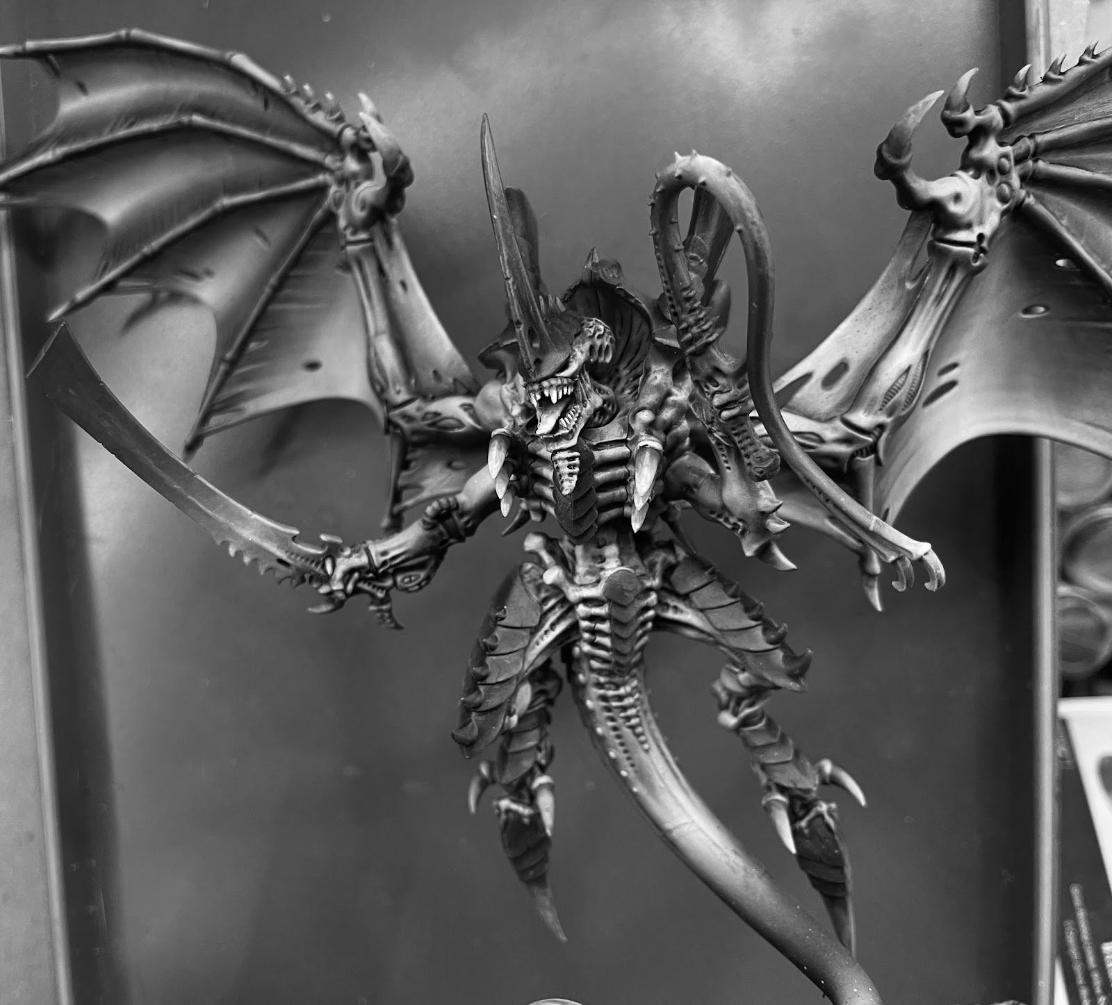
As a final test, let's look at the tyrant in greyscale. This lets me validate that I’ve done enough value variation to emphasize the points of interest I talked about in the beginning.
I think that’s pretty much perfect for points of interest. If I’m going to nitpick I think I could still do more work on the carapace and maybe a bit more work on the sword, this guy’s definitely ready for the table though.
Wrapping Up
Photo Credit: Mike
I hope this was educational and fun! If you have any questions I hang out in the stat check discord regularly and I’m happy to answer any questions you might have about either duplicating my scheme or trying to adapt it to your own scheme. Just like winning at 40k, getting good at painting requires reps so pick up your brush and keep at it.
A massive thank you to Mike for writing this all up for us, it’s a pleasure to see your process in work.
If you’re part of the Stat Check Discord and you’d like to put together a tutorial like this, get in touch, we’d love to see all of your ideas and share them with the world.
The Stat Check Team